
COLOUR MANAGEMENT
What we see is what you get
Anyone who’s worked in print will have experienced this: A wet proof or final printed document that colour-wise just isn’t comparable to the version viewed on screen or colour laser copies. The colour variation can be massive.
Whilst designers and photographers can appreciate why this difference occurs and recognise the challenges in achieving colour consistency and accuracy, sometimes clients do not. So colour accuracy can become an issue on a project – particularly if it’s only on press that surprises arise.
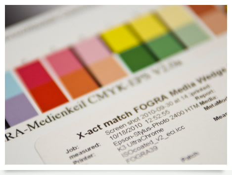
We use an internationally recognised colour management system called Fogra to prevent colour surprises on press. What we see on our screens – because our screens and the supporting kit are calibrated this way – is what you get when you print.
Every digital proof we make closely matches what we see on our screens, We take a reading from target colour swatches and the resulting data determines whether or not the proof sits within the tolerance range of the Fogra standard, providing a ‘pass sticker’ to those that do. The colours you see on a proof, having passed all the necessary criteria, can be closely matched when reproduced on press.
On large scale projects, having a colour standard applied across all imagery means every picture within a book can have a consistent tone and colour quality.
So before you print, work with Retouch This to understand the realities of colour. You can visit our studio to see your work on print accurate screens. Or please order a contract proof to review what your images in print – on coated or simulated uncoated stock – will look like.
No more unwanted surprises and unexpected costs.